RackForms
v7.8.9
rackforms blog

Latest Release: Build 959 - November 6th, 2025

Welcome To The RackForms Blog!
You come across a lot of cool ideas and trends when developing software, here's where we like to share 'em!
A new Years Wish List DEC 30th 2012
As we close out 2012 and look forward to 2013 I'd like to ask you, the RackForms user community, for your input. Where would you like to see RackForms go? Would more e-commerce feature be your top request, or perhaps more expansive mobile features and support?
To let me know please feel free to drop me a direct line at info at rackforms dot com.
Thanks to all who I've had the pleasure of working with this past year, and let's have a great 2013!
Team Manager Demo Series Now Live DEC 19th 2012
Watch me step through the process of building a real web application in this 1080p YouTube series.
This marks the first time I create items in real time as opposed to preparing each step. The main benefit of this approach is getting to see a professional developer work through tasks in real time.
Build Update: 763 DEC 17th 2012
Just a quick video update for the newest release of RackForms, build 763. We've added some great new items like tab order support for Buckets and variable fields in Datagrids. Enjoy!
Feature Update: Datagrid DEC 11th 2012
Just because it's cold outside doesn't mean we're sitting on our hands inside : )
In this video we'll take a quick look at the new features baked into the Datagrid module, specifically field overrides and default values. These new features allow us to create more complex data grid items to capture a wider variety of user input.
Of course like all feature updates it's free to existing users, and simply part of the world-class RackForms feature set.
Populating Checkbox Items With Data Demo Nov 30th 2012
With RackForms we don't have just one or two ways of populating checkbox fields, but five! We have the easy ways of course, just typing values, but we can also use source arrays and dynamic database calls.
In this video we go over all of these methods and show you where and how they all work.
RackForms PDF Output Demo Nov 27th 2012
Creating PDF files from our RackForms output is done in a single click. However, their are always more ways to be creative to make our PDF files work harder for us.
In this demo video then we share some thoughts on PDF creation, and look at how we can not only create PDF's, but email them, create custom PDF output files, and so on. As always we love to hear from you, please contact us with any questions of comments!
Running Advanced Subqueries In Builder Nov 20th 2012
An advanced but great video for learning more about running subqueries in Builder forms.
The Query Module Shortcut Means Huge Time Savings Nov 19th 2012
I'm excited about this one! Introducing a new, super fast and concise way to add dynamic tokens for Query module output.
Why read when we can watch:
Of course as with all features this is free for all RackForms users, simply head to the downloads site to get the goods!
Link of the day - Designing Narrative Web Forms. Nov 16th 2012
This article makes the case for creating forms that read more like a story than our yearly tax forms : )
Of course it should be said using RackForms to create these types of forms is a snap. Simply switch the page mode to Free Form mode and place elements anywhere on the page we need. With some CSS along the way we can get pretty much any layout we want.
Back to the article then, towards the bottom of the page they show an example of a failed attempt at narrative design and while right in most ways, I think they miss an important point -- that with a bit of line-height and CSS for the text boxes we can get a perfectly acceptable result.
Thus, I took it upon myself to recreate both version of the form to see what RackForms brings to the table and came up with the following results:
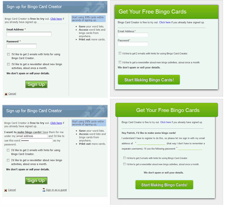
The images on the left are from the sample form, the ones on the right are the "remade" versions via RackForms.
The big difference of course is instead of cramming the form fields into a standard text block we let it breath with some line-height. This gives us more room to work with, which is then matched with CSS to the fields themselves to remove the background and all borders.
While this is clearly better it's only the start. We could easily add some custom Google Fonts, make the form wider, and add images for added punch.
Want to try out some narrative design yourself? The best way to see this form in action is to load it up in the RackForms editor under:
Load Example Job > Narrative Design > narrative-design
Link of the day - Call To Action Theory In Action. Nov 13th 2012
A good read on the changing nature of design flow and UX design.
Working With Checkbox Data In RackForms Nov 4th 2012
Just a quick update here to show off a video that covers a very important topic in RackForms, working with Checkbox data.
Responsive Web Design In RackForms Nov 1st 2012
You've just finish building your beautiful form and embedded it on your WordPress page when you realize something's wrong...
The problem: the finished form looked great in the RackForms editor but when you shrink the WordPress page to mobile phone sizes the form gets chopped off. The right edge of your form elements get covered up and your radio item groups aren't even visible.
We've just fallen victim to something called Responsive Web Design, and while great in theory, it's not always obvious what's happened or how to fix it.
So what is Responsive Web Design? The basic idea is one layout works across all display devices, a clear break from the idea of having multiple versions of the same site -- desktop and mobile. One key aspect is we don't need new technologies to implement this design pattern, just good old box-model CSS and media queries.
The trick is creating a responsive layout isn't always so simple -- if it was we'd have always designing sites this way. It's a quiet revolution, the same way that XMLHTTPRequest was rolled into what we now call AJAX over several years.
The good news is RackForms sports an easy solution for all of this when it comes to form building: The automatic creation of a mobile version of every form we create and a handy WordPress plugin.
Mobile Versions Of Every Form We Create
When we save a job in RackForms we always get two versions: the exact version we've designed in the editor and a mobile-enhanced one. The mobile version of our form contains the same fields and layout order, but is updated and changed with:
1. All fields are now 97% the width of the screen for easy touch access.
2. The page is laid out in sortable mode, if it wasn't already.
3. Any form centering, box shadows, and backgrounds are removed.
4. A block of mobile phone specific CSS is added.
5. Field labels are set to top as opposed to inline, this makes sure fields never overflow and saves horizontal space.
6.
Bucket items are set to float:left to make sure they aren't cut off on the right edge of the screen.
The result of these changes means a form, no matter how it was designed in the editor, looks and works great on mobile devices.
To use the mobile version of a form all we do is append a -mobile to the end of the job name. If using iFrame embed code this means simply changing the src property to use -mobile. It's a super simple change that ensures our forms act and work great across all screen sizes.
The RackForms WordPress Plugin
Here's the fun one -- the most recent versions of WordPress (3.5+), use responsive templates by default (Twenety-Twelve and Twenty Eleven).
The trick with these templates is while we can use the -mobile version of our form one other issue remains: sometimes, particularly when using Layout Buckets, our mobile version will resize vertically, and this is something iFrames aren't too fond of -- the form content will get "hidden" at the bottom of the iFrame because iFrames do not resize automatically in either direction.
Enter the WordPress plugin. With a simple activation click the iFrame plugin will append a small block of JavaScript to our WordPress pages that automatically -- and this is the coolest thing! -- loads the mobile version of our form and resize the iFrame to make sure all content is always shown.
In short the WordPress plugin is the ultimate convenience -- we can build forms however we want and let the plugin do all the work for us.
To sum up I've created a video that shows this off and more, because hey, seeing is believing : )
HTML5 Drag and Drop Uploads in RackForms Oct 24th 2012
You can never have too many ways to upload files, and to that end we're proud to announce the brand new HTML5 powered file uploader in RackForms.
This new upload method is well supported across most modern browsers, though it degrades gracefully when needed to a standard file upload slot.
Best of all it supports multiple files at once, can be included more than once per form page, and supports all standard file upload methods and security features. HTML5 Powered Drag and Drop Uploads -- RackForms is simply unbeatable when it comes to features an value. To see more check out this quick demo video!
Google Web Fonts Real-Time Preview In RackForms Oct 19th 2012
Good news! Starting in Build 760 we’re adding a real-time preview for all Google web fonts in the RackForms web form editor.
This means we can now see what our custom fonts will look like without having to preview the form — a great time-saver.
But that’s not all! I’ve also added a really handy shortcut:
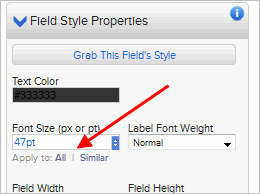
That is, when setting a font size we can click All to apply this size to all elements on the page, or Similar to only those elements of the same type.
This is handy for two reasons:
1. First, unlike “traditional” fonts, custom fonts tend to be a bit more eccentric, which means the standard sizes we use for the old standby fonts (Myriad, Helvetica, etc) do not always work with our layouts. Thus, when using custom fonts we’ll find ourselves needing to set custom sizes more often. This shortcut means we’ll keep a more consistent style and not have to spend time doing so. A simple click and all fonts for all elements become the same size.
2. Allowing us to decide which elements get the same style (like elements or all), means we can be much more precise when doing so. For example, a header element should not be the same size as our field labels in most layouts.
As always this update is free for all current users, and should be out within a weeks time.
Thanks for reading and happy form building!
Good hints on web form development Oct 16th 2012
Just a quick link: Came across this today, good stuff for anyone looking to create web forms.
In Browser Code Editing For Your Web Forms Oct 10th 2012
RackForms is designed for all types of users: from the most simple “I just want a form” types to professional developers.
For the latter part of being a professional developer means writing your own code. RackForms has always allowed for this, but what you may not know is when it’s time to get under the hood we’ve got a great code editor ready to handle the job.
It’s called the RackForms Code Editor, and has lots of great features:
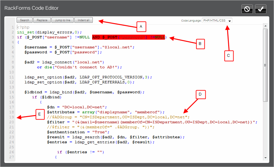
A) We have several common actions in this bar, from jumping to a link to the incredibly handy automatic code indent function.
B) We automatically highlight code errors, which is even better considering…
C) The code editor support all common languages we’d need in RackForms, from raw PHP, CSS, JavaScript, to the almighty PHP/HTML/CSS combo. That’s right, we even highlight all three at once!
D) Code is syntax highlighted as you would expect, making reading long sections of code a snap.
E) Line numbers help you keep track of where in the document we are.
Edit Code As We See Fit
Of course all of these features, indeed the code editor itself, are available for the taking anytime we see this guy:
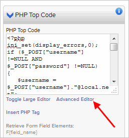
That is, any place we see the Advanced Editor link we can leave the drab confines of the simple text area and code in style : )
Beautiful, professional code editing: just one more reason why RackForms is the gold standard in web form creation!
RackForms & Mobile Ready Web Forms Sep 25th 2012
In this post I want to quick touch on a very important feature of RackForms: mobile ready web forms.
Their are two main areas RackForms focuses on: Layout and features.
Layout: Every form we create in RackForms resides in a folder with the same name as the job it belongs to. RackForms also creates a mobile version of our form, and this guy can be accessed by simply appending a -mobile to the end of the job name.
So for example, contact-form becomes contact-form-mobile.
The key benefit of this mode is our form is automatically re-sized and reconfigured to work on mobile screens. So for example, we switch any free-form layouts to sortable, make sure labels are on top of our elements, and so on. While it’s always a good idea to create a specific mobile version of a form if that’s its intended audience, nine times out of ten the RackForms one will work perfectly for all other needs.
Features: the other area RackForms focuses on is features for making mobile forms better.
The top two in this category are Mobile Sliders and Digital Signatures.
Both of these guys allow us to build forms that make the data input process as easy as possible, while remaining compatible with traditional mouse and keyboard setups.
The takeaway: A huge amount of growth in the mobile sector means building forms that work on such devices is essential. RackForms makes this process a snap with great features and automatic mobile form creation!