RackForms
v7.8.9
custom reporting

Latest Release: Build 959 - November 6th, 2025

Home > Survey & Reporting > Custom Reporting
Custom Reporting
In Brief: The survey viewer has two main reporting modes: Standard and Custom. This document describes options and properties of the custom reporting option.
Dependencies: A saved job with entries saved via the Entry Viewer submission item.
Hints & Tricks: Most survey forms work best with data collected via checkbox or radio items.
Printing Survey Results: because of restrictive default browser settings most users will need to enable the printing of background colors and images in order for the printing of survey results to work.
For Firefox this setting is managed when we navigate to:
File > Page Setup > Print Background (colors and images)
In IE 10 it's:
Print > Page Setup... >
Print Background Colors and Images
As of 8/15.12 we have not found a way to enable this feature in Google Chrome, which means if we need to print survey results Google Chrome will not be a viable option. Of course this may change in the future, so please check your browsers documentation for more info.
Options/Properties
Series
A series is a single question from a form page, and all its related responses. The display of a series of data, regardless of type, is called a plot, and the resulting plot, along with any axis and grid lines, is called a chart.
An incredibly powerful feature of the RackForms implementation is the ability to combine multiple series (questions), into one single chart. For example, we can graph the transfer speed of several hard drives for different file size., one series for each operation: read, write, and read+cache.
This is why we have Series 1, Series 2, and so on. Each item we select from this drop down will display that items data in the format we select via that series items Display drop down. Currently, RackForms supports up to five series in a single chart.
It's key to note not all combinations are supported, and not in all orders. For example, we cannot (yet), start with a donut chart for the first series, and then use anything other than another donut chart for the second series. If we must have a specific combination, it's recommended to create two stepparent charts.
Other combinations are supported in a specific order, For example, while we can combine a horizontal bar and pie chart, we can only do so if the horizontal chart comes before the pie chart.
Still other combinations will display, but may not always be the most appropriate type to show users. For example, we can combine a vertical and horizontal bar chart, but the axes data may be hard to interpret.
The safest course is to only combine series of the same data type, as this way we can be sure the data display axes are correct, and the values displayed for each item are correct as well.
Display
Each series item has several display types. We can chose any value at any time, but as noted above, not all are currently supported.
Of particular note are the Line 1D ad 2D options. Assume we had a form that let users select numbers between 1 and 3. Let's say a single respondent submitted the form 4 times, entering the following values:
1,2,2,3
A 2D line chart groups all related values together to create totals. For example, RackForms, when using 2D line charts, will interpret the data as:
1 item for 1, 2 for 2, and 1 for 3.
This will show the popularity of each choice, but looses the actual raw data. This is where the 1D option comes in.
The 1D graph simply keeps each raw submission, which means the line chart will have 4 data points:
1,2,2,3
It's also important to properly set the Ticks property when using 1D charts, which is discussed below.
Format
The format value applies per series, and is how the data will be shown to the user both in axes, and as point labels next to each plotted value.
The format is reminiscent of sprintf, and uses shorthand for decimal and string values for our data points, along with any custom text we specify.
For example, to display values as $some value, we would use the d operator for digit, and a $ sign.
$%d
Note how the %d will be displayed as the raw data value.
We can also use f for float, this will display the element with a decimal and 0's. This can be handy for very small values between 0 and 1.
In most cases it's recommended we do not touch this value, unless we need to display money formats.
Custom Width and Height
By default, all custom charts are set to 100% of the page with, and 500px high. We can change these values at any time to match our layout needs. However, it's key to note our Direct Link display uses a responsive script to automatically resize the graph to the current container width. In short, it's usually best to leave the width value blank, as that means default to 100% of the page width.
Label X and Y
The values that will display to the left and bottom of the chart.
Ticks X and Y
These value are only used for line charts, and indeed, are required for 1D line charts. Both values must be valid JavaScript, 1dimentiional arrays.
For example, to create a 1D line chart that plots transfer sizes for common file sizes, we could use:
Ticks X = ['32KB', '64KB', '128KB', '256KB']
Ticks Y = [0, 0.5, 1, 1.5, 2, 2.5, 3]
This would create the chart as:
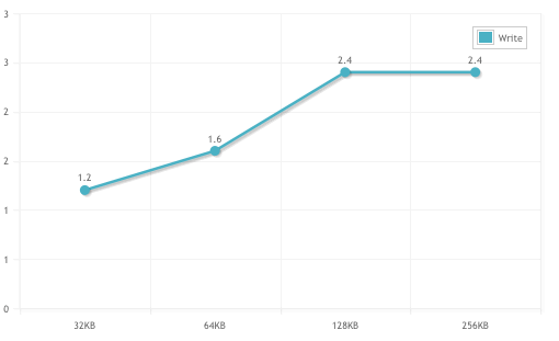
Again, 1D plots requite us to define these values.
Direct Link / Widget Link
Key to the charting system is the ability to quickly share and embed the final, resulting chart image. RackForms provides two links for this purpose, both located just below the chart.
The Direct link creates a single url, the Widget wraps the URL in an iFrame.